
Common Typography Mistakes To Avoid In Graphic Design
Typography is a critical element in graphic design that can make or break a project. It encompasses the selection, arrangement, and presentation of typefaces to effectively communicate a message. It plays a crucial role in creating a visually appealing and cohesive design, while also conveying the intended message accurately.
Avoiding common typography mistakes is essential for achieving a strong and visually pleasing design. These mistakes can range from simple errors to more complex issues that negatively impact the overall visual design. By being aware of these mistakes, graphic designers can enhance their design skills and create stunning and effective designs.
Effective communication through typography is vital in graphic design. It allows designers to convey a message clearly and engage viewers. When typography is done right, it establishes a visual hierarchy that guides viewers’ attention, highlights important information, and creates a sense of order. On the other hand, typography mistakes can confuse viewers, making it difficult for them to navigate and understand the intended message.
Too Much White Space Between Letters and Words
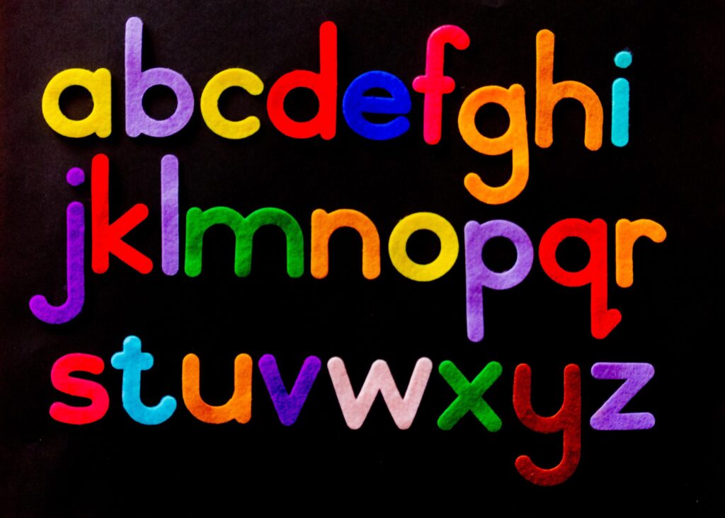
Avoiding too much white space between letters and words is crucial in graphic design to ensure optimal readability and visual appeal. While white space, also known as negative space, is essential for creating a balanced design, excessive spacing can hinder the overall readability and impact of the typography.
To prevent this common typography mistake, it is important to consider appropriate spacing. The spacing between characters should be consistent and proportional, maintaining a visually pleasing balance. Pay attention to kerning, which refers to adjusting the space between specific letter pairs to create a harmonious flow.
Similarly, spacing between words should be carefully considered. Too much space can make the text appear disconnected and difficult to read, while too little space can make it appear cluttered and overwhelming. Aim for an even and comfortable spacing that allows the reader’s eyes to flow effortlessly through the text.
By using appropriate spacing, graphic designers can enhance the overall readability and aesthetic appeal of their typography. It ensures that the text is easily legible, while also complementing the visual elements of the design. With careful attention to spacing, typography becomes a powerful tool for effective communication in graphic design.
Incorrectly Using a Serif Typeface
When it comes to typography in graphic design, the incorrect use of a Serif typeface is a common mistake to avoid. While Serif typefaces can add a sense of tradition and elegance to a design, they can also cause typographic confusion if not used correctly.
One common mistake is using a Serif typeface that is difficult to read or illegible. It’s essential to choose a Serif typeface that maintains legibility even at smaller sizes. Fonts with overly intricate serifs or thin strokes can make the text hard to decipher, especially in digital formats or when printed in small sizes.
To avoid this mistake, it is important to prioritize legibility over aesthetics when selecting a Serif typeface for your design projects. Choose a font that has clear and well-defined letterforms, with adequate spacing between characters. Test the font at different sizes and on various devices to ensure readability across different platforms.
Additionally, consider the overall visual hierarchy of your design. Balance the use of Serif typefaces with other design elements, such as headings or sans-serif fonts, to create a cohesive and visually appealing composition.
Using Raster Instead of Vector Images
When it comes to graphic design, one common mistake is using raster images instead of vector images. Raster images are made up of pixels, which can lead to pixelated graphics when enlarged or resized. On the other hand, vector images are created using geometric curves and lines, allowing them to remain crisp and clear at any size.
Choosing the appropriate image format is crucial for a successful design project. Raster images are typically saved in formats such as JPEG or PNG, while vector images are often saved as SVG or EPS files. JPEG is a common format for photographs, but it can result in loss of quality and image degradation over time. PNG, on the other hand, is a better option for images with transparency or when crisp details are needed.
By using raster images when vector images are needed, designers run the risk of producing pixelated graphics that can detract from the overall design. Understanding the difference between raster and vector images and selecting the right image format can help ensure that graphics remain clear, no matter the size or purpose.
Ignoring the Target Audience’s Preference for Fonts and Colors
Ignoring the target audience’s preference for fonts and colors is a common mistake in graphic design. When creating any design, it’s important to consider who will be viewing it and what will appeal to them.
Fonts play a crucial role in communicating the message effectively. Different fonts evoke different emotions and have distinct personalities. Using a font that resonates with the target audience can enhance the overall design and make it more relatable. For example, a playful and whimsical font may be suitable for a design targeting children, while a clean and professional font may be more appropriate for a business audience.
Similarly, colors have a strong impact on the viewer’s perception and emotions. Different colors have different meanings and can evoke various feelings. Ignoring the target audience’s color preferences can result in a design that fails to resonate with them. For instance, a bright and vibrant color palette may be appealing to a younger audience, while a more muted and sophisticated color palette may be preferred by an older demographic.
By considering the target audience’s preference for fonts and colors, designers can create designs that effectively communicate and engage with the intended viewers. Understanding the audience’s taste and making informed design choices can lead to more successful and impactful designs.
Not Choosing a Single Design Theme or Color Scheme
Not choosing a single design theme or color scheme can have a negative impact on the overall effectiveness of a graphic design project. One of the key elements in creating a visually appealing and cohesive design is maintaining visual consistency. This means that all the design elements should work together harmoniously to convey a unified message.
When multiple design themes or color schemes are used in a single project, it can create confusion for the viewer. They may not be able to grasp the main message or purpose of the design. Additionally, using too many different design themes can dilute the impact of the design, making it less memorable and reducing its effectiveness.
By choosing a single design theme or color scheme, designers can ensure that the design elements support and reinforce each other to create a unified and impactful visual experience. This not only improves the overall aesthetics of the design but also increases its clarity and message delivery.
Relying Too Much on Negative Space or Dark Colors
Relying too much on negative space or dark colors in graphic design can be a common mistake that designers should avoid. While negative space is an important design element that can create a sense of balance and space, relying too heavily on it can result in a design that feels empty or lacks visual interest.
Similarly, using dark colors excessively can make a design feel heavy and difficult to read. Balance is key in graphic design, and it’s important to strike the right balance between positive and negative space, as well as between light and dark colors.
Readability is another crucial aspect of design that can be compromised when too much negative space or dark colors are used. Text placed against excessive negative space or set in dark colors can become hard to read, affecting the overall effectiveness of the design.
To avoid this mistake, designers should consider visual hierarchy and ensure that the main message or focal point of the design is clear and easily discernible. By finding the right balance between negative and positive space, as well as using a suitable color palette, designers can create visually appealing designs that effectively communicate their intended message.
Not Paying Attention to Kerning, Tracking and Leading
One common typography mistake in graphic design is not paying attention to kerning, tracking, and leading. These three elements play a crucial role in determining the spacing between individual characters and characters within a word or phrase, greatly impacting legibility and overall design.
Kerning refers to adjusting the space between two specific characters to enhance visual harmony and prevent awkward gaps or overlaps. It ensures that each character flows smoothly into the next, creating a cohesive and visually appealing look.
Tracking, on the other hand, refers to the overall spacing between all the characters in a word or phrase. It is used to increase or decrease the space uniformly, maintaining readability while achieving the desired visual effect. Providing adequate tracking helps in preventing crowded or scattered text that can negatively impact legibility.
Leading refers to the vertical spacing between lines of text. It is crucial for ensuring readability and avoiding the text from appearing too cramped or too loose. Proper leading enhances the flow of information and makes the text easier to navigate.
By neglecting to pay attention to kerning, tracking, and leading, the overall readability and legibility of the text suffer. Words may appear too cramped, making it harder for readers to distinguish individual characters or words. Conversely, excessive spacing between characters or lines can create a disjointed or scattered appearance, making it difficult to follow the text.
To create visually appealing and effective typographic designs, graphic designers should carefully consider and apply appropriate kerning, tracking, and leading. This attention to detail can significantly enhance the overall readability and legibility of the design, ensuring it effectively communicates the intended message to the audience.
Not Knowing When to Use Display Typefaces Versus Text Typefaces
Display typefaces and text typefaces serve different purposes in graphic design, and knowing when to use each is essential for effective communication.
Display typefaces are more decorative and attention-grabbing, often used for headlines, titles, or short pieces of text. They come in a variety of styles, ranging from elegant script fonts to bold and geometric designs. Display typefaces add personality and visual interest to a design, making them ideal for creating a strong visual impact or conveying a specific mood or theme.
On the other hand, text typefaces are designed for readability in longer blocks of text. They are optimized to ensure legibility and make it easy for readers to navigate through paragraphs or pages of content. Text typefaces are typically more neutral and have simpler, more straightforward designs compared to display typefaces. Popular examples of text typefaces include Helvetica, Times New Roman, and Arial.
When choosing between display typefaces and text typefaces, consider the context, purpose, and length of the text. If you’re designing a poster, advertisement, or social media post with a short message, a display typeface can help draw attention and create visual interest. However, if you’re working on a book, magazine, or website with longer paragraphs of text, a text typeface would be more appropriate to ensure readability and a smooth reading experience.
Overusing Stock Images or Flat Vector Images
Overusing stock images or flat vector images in graphic design projects can be detrimental to the overall quality and effectiveness of the design. While these images can be helpful in certain situations, relying on them too heavily can lead to a design that looks unprofessional and lacks uniqueness.
Stock images are readily available and easy to use, which can make them tempting to incorporate into designs. However, using them excessively can give the design a generic and unoriginal feel. These images are often used by many other designers, which means that they may be seen repeatedly by viewers, diminishing their impact.
Similarly, flat vector images, while versatile and convenient, can contribute to a design lacking uniqueness. These images often have a simplistic and minimalistic style, which can be visually appealing, but if used excessively, it can give the impression of a lazy design with little creativity.
To avoid these pitfalls, it is important to seek alternatives to stock images and flat vector graphics. Consider creating or sourcing custom illustrations or photographs that are specific to the design project. This will help ensure that the design has a distinct and personal touch, making it more memorable and engaging for viewers.
Conclusion
In conclusion, there are several common typography mistakes that can be avoided in graphic design. Mistakes like using too many fonts, not properly kerning and tracking text, relying too much on default settings, and failing to pay attention to readability can all have a negative impact on the overall look of your design.
By taking the time to familiarize yourself with proper typography practices, you’ll be able to create designs that are both aesthetically pleasing and legible. Additionally, understanding the fundamentals of typography will help you create visually appealing and effective designs for any medium. With a little practice, you can become an expert in no time.